The Websites to Compare
Describes how each site exhibits repetition.
Notice the repetition in color.
The website exhibits repetition through utilizing elements with alternating color schemes.
Notice how the number of columns switches consistently between two and three throughout the page.
The website exemplifies repetition in its use of repetitive layout and colors. Alternating the column count leads to a unique design that is appealing to look at.
Describes how each site exhibits contrast.

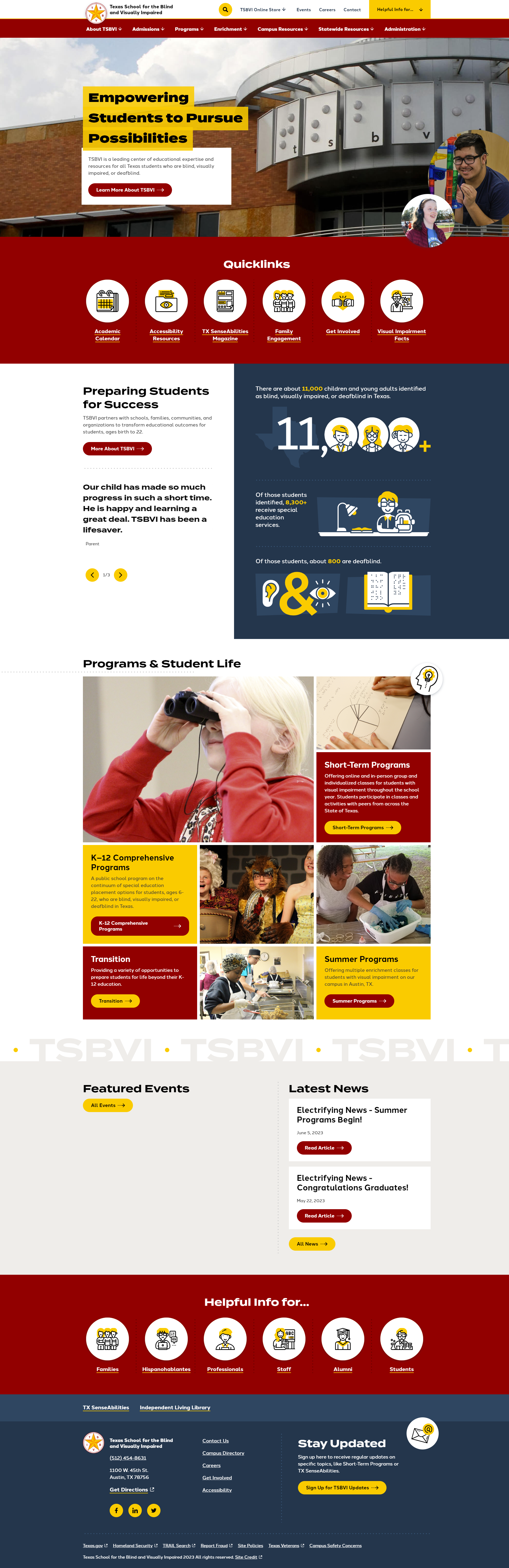
TSBVI menu
TSBVI switches the background and foreground colors to create contrast.

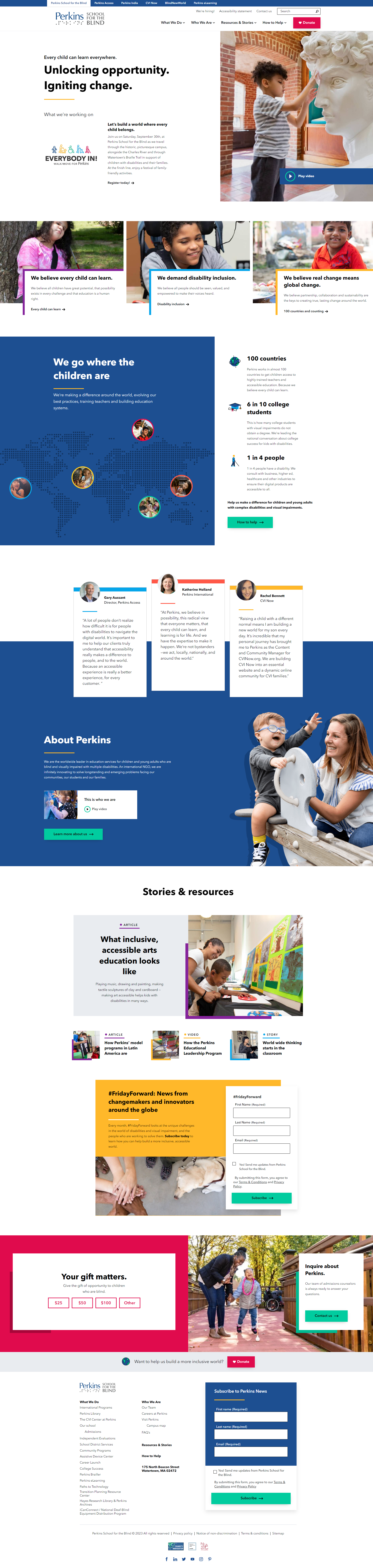
Perkins article list
Perkins uses change in color to create contrast between list items.
Describes how each site exhibits alignment.
Grid alignment is great for attracting both eyes.
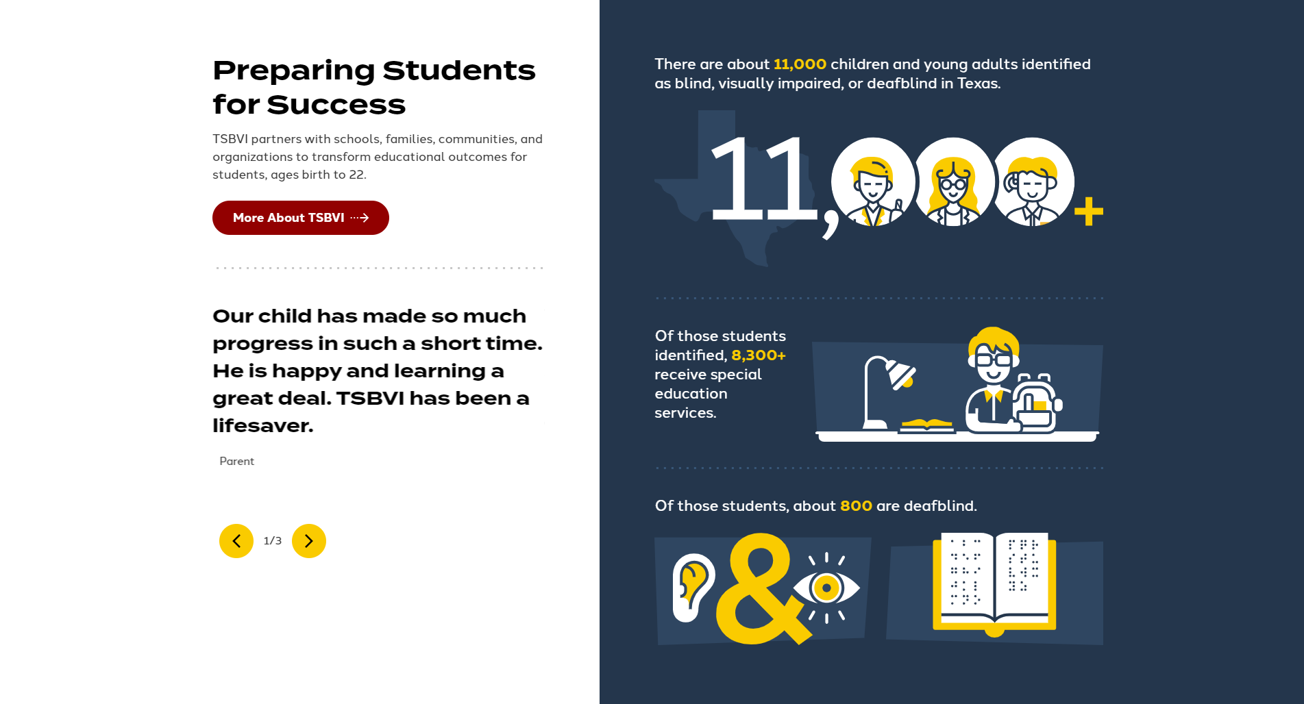
source: TSBVI - Preparing Students for Success
Alignment could be better on the horizontal plane.
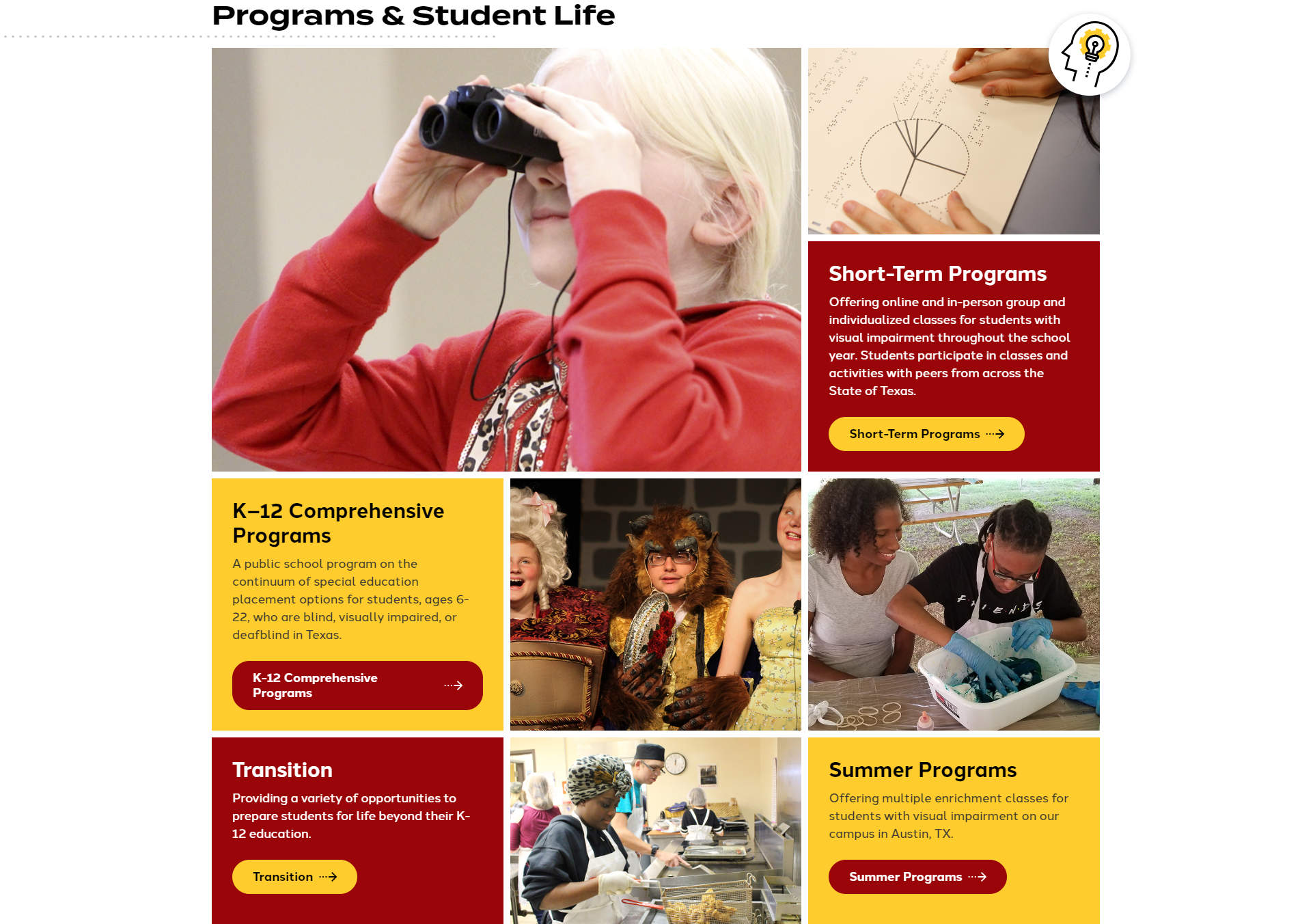
source: TSBVI - Programs & Student Life
Items of similar subject are all vertically aligned with each other. The site also uses horizontal alignment to covey the relationship of the image to the subject matter. There are some images that may be considered poorly aligned for the mere fact that the columns are not exactly the same width. Over all TSBVI has done a better job at exhibiting alignment on the home page.

Aligned
source: Perkins - Ocean animal sounds book and activities
Poorly Aligned
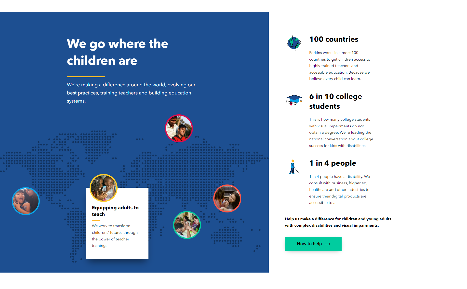
source: Perkins - Equipping adults to teach
It is hard to find consistent alignment on Perkins' home page. Although there are elements that have equal alignment, they are skewed up or down which breaks the consistency. I am not sure the site did a good job with creating a consistent layout except for in the navigation bar where elements are properly aligned with each other and do not tend to clash like other elements on the page. The site may be accessible but it is not as visually pleasing as other sites. Once off the home page, alignment is exhibited gracefully (see Figure above). It is intriguing how some sites can exhibit such great and foul alignment practices on the same site. It is as if the devs changed.
Describes how each site exhibits proximity.
Out of proximity

In proximity
The buttons and icons on the site shift their position and box shadow when the mouse comes within proximity of the element

Out of proximity

In proximity
Most of Perkins' navigational elements, which resemble those depicted above, have noticable changes to color.

Out of proximity

In proximity
Most of the other interactive elements have subtle changes when the cursor is in the proximity.
Describe how each site that you chose to review exhibits web design best practices.
The improper declaration of SVG xLink library is not ideal for showing best practices. The site also uses a convoluted menu navigation system form a keyboard navigation standpoint.
The website uses a Document Tag Structure that contains the 'html', 'head', 'title', 'body', 'header', 'main', and 'footer' tags. The page also uses accessibility features such as alt and logical heading order.
I am not as impressed by the site's lack of coherence to web design best practices; despite being a gold standard for accessible web. The site has non standard use of the id
Like Texas School for the Blind and Visually impaired, the website uses the "Ten" and a logical heading order.
Recommend three improvements for each site.
- Hide sub-menus from the screen reader when they are collapsed.
- Remove unnecessary hidden links that are not accessible to sighted and non-sighted alike.
- Cut back on the use of !important in the CSS file.
- Differentiate the background color of green link buttons to change more more when hovered.
- Adding the aria-current="page" for the current page of the site.
- Hide the redundant Donate button in the mobile navigation menu.